共鸣设计
契合当代审美的全新腕表与主视觉形象
“power design project”的首款力作——“collection 1”腕表,并非传统意义上的腕表,而是一款旨在唤醒人们内心深处审美感知的作品。
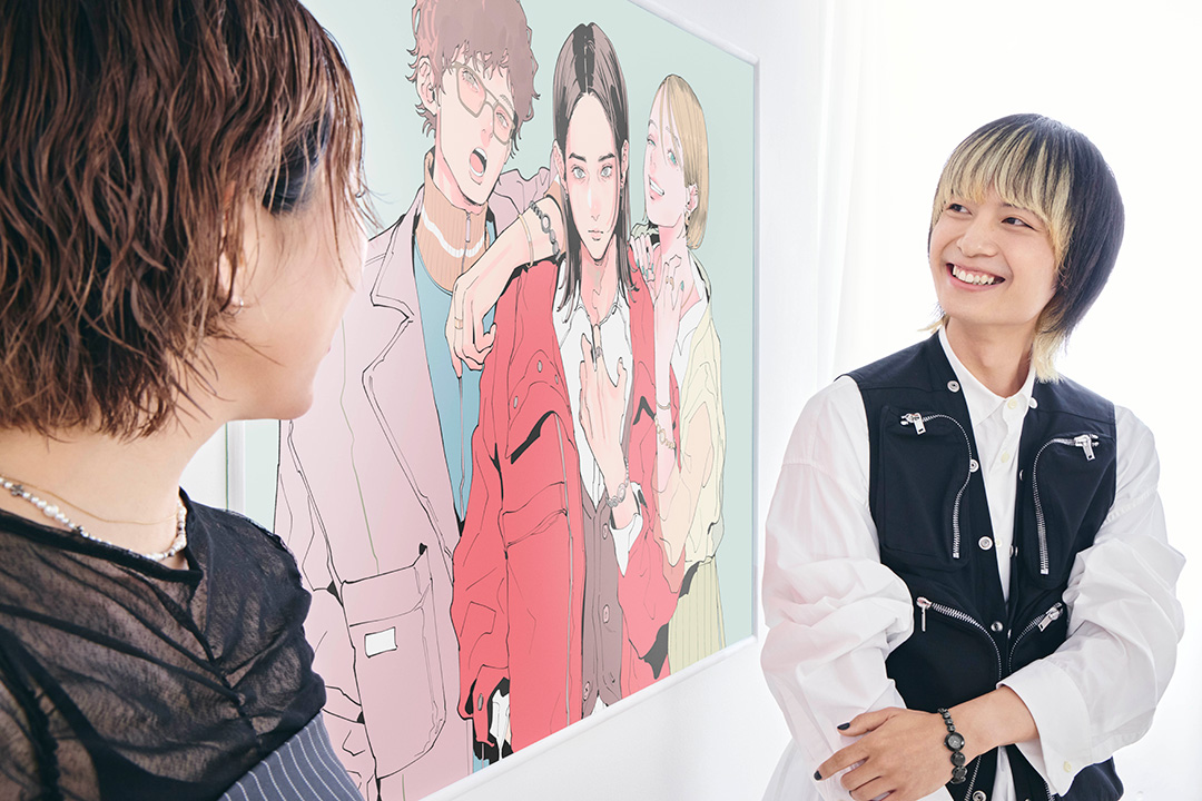
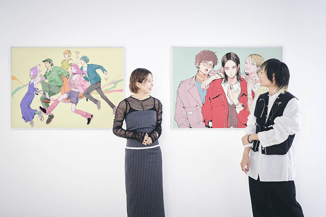
我们特邀专为Seiko power design project及“collection 1 ”打造主视觉形象的插画师NAKAJI PANTZ与主创设计师菅沼佑哉(Yuya Suganuma)共同展开专访,探寻collection 1的创作历程,解读其独特魅力。
重启 The power design project

菅沼佑哉(Yuya Suganuma): 学生时代起,腕表已是我生活中不可或缺的一部分。当然,那时我并没有很多表,但在校园之外与人会面时(比如实习期间),我总会戴上腕表。在我看来,腕表绝非单纯的计时工具,更是一种自我表达的方式。
2021年入职SEIKO后,菅沼参与了Seiko 5 Sports系列的设计工作。大约在同一时期,他得知了重启“power design project”的计划——该项目曾于2001年至2009年开展,是一项旨在鼓励SEIKO腕表设计师自由探索设计新可能的实验性计划。
项目鼓励SEIKO设计师跳出传统规范,通过全新设计思路与多元尝试打造腕表新品,尤其积极鼓励像菅沼佑哉这样刚加入公司的年轻设计师参与。
菅沼佑哉(Yuya Suganuma): 常规设计流程是通常由策划人员提出概念,设计师再据此进行创作。而这个项目让我能从概念阶段就深度参与,实属难得的机会,我当时满怀热忱想要加入。不过,由于刚入职不久,我对腕表的专业知识还存在欠缺。幸运的是,前辈同事们在腕表结构与工艺处理上给予了我许多帮助,我才得以完成完整的设计方案。
当时,菅沼参与的2022年项目主题定为“REBIRTH”(重生),核心思路是选取SEIKO过往推出的标志性产品与技术,以当代视角重新演绎。该项目还有另外一项明确要求:最终成果必须是搭载机芯、正常运转的腕表产品,而非单纯的设计原型。
菅沼选择的设计原型,是1984年推出的女士腕表——SEIKO Tissé。
菅沼佑哉(Yuya Suganuma): 除了腕表,我当时对珠宝和配饰也抱有浓厚兴趣。近年来,手链式腕表已不再流行,但当我在 SEIKO的古董表档案中发现Tissé时,却觉得它依旧充满新鲜感。我本能地认为,只需稍作改良,就能打造出一款契合当下审美的时尚腕表。尽管如此,设计研发过程仍历经了无数次尝试与调整。
这款作品本是为女性设计,想要赋予其当代气息,我的首要想法是打破性别、年龄等界限,打造一款如配饰般的个性化腕表。如果它仅仅是“小巧可爱”,人们很可能会下意识将其归为女表。我一直努力寻找突破点,希望让人们以全新的视角看待这款表。
为 1984年的经典款注入21世纪20年代新元素
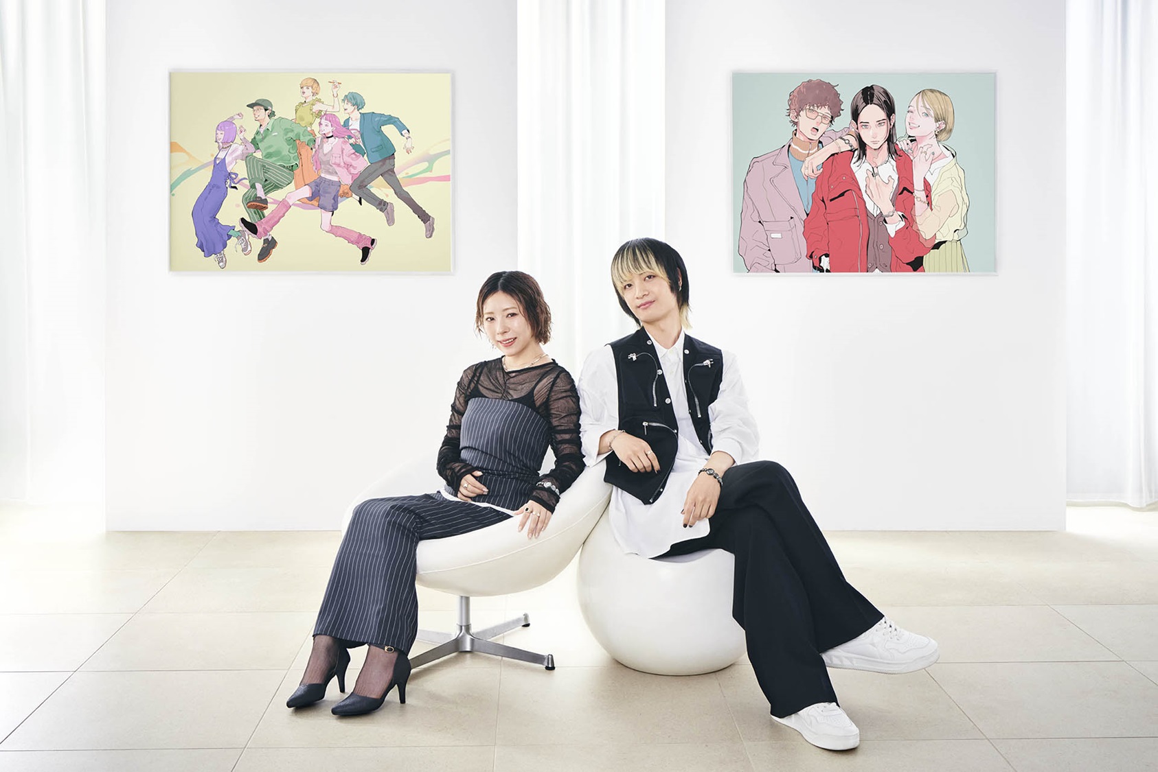
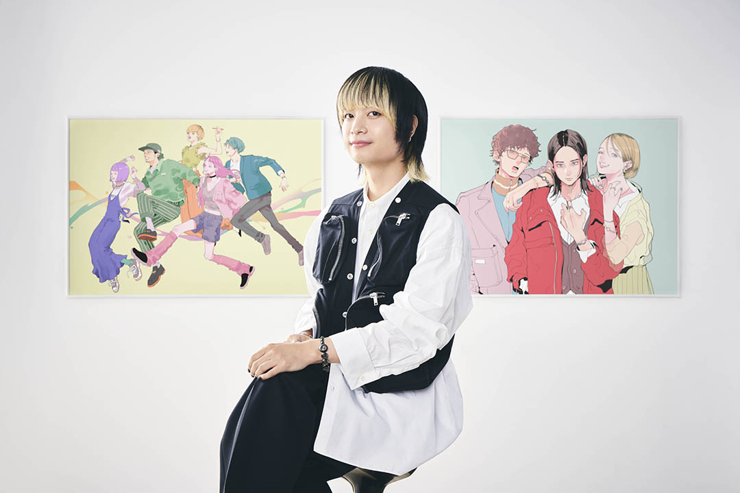
对于菅沼在设计中遇到的挑战,插画师NAKAJI PANTZ有着强烈的共鸣,而她的工作是负责Seiko power design project设计专案及该系列下“collection 1”的主视觉图设计。
NAKAKI PANTZ: 原型款Tissé腕表既独具特色,又兼具经典优雅气质。尽管设计简约,却能感受到其背后精妙的设计巧思。而菅沼打造的“collection 1”,无疑融入了21世纪20年代的现代风格。
对我而言,腕表首先是一件时尚单品,同时恰好具备精准的计时功能。“collection 1”既不过于休闲,又适合正式场合佩戴,堪称理想之选。
菅沼佑哉(Yuya Suganuma): Tissé的奇妙之处在于,它既像一串珠链般富有配饰感,又带有强烈的工业设计感。因此,我一直在思考如何在新设计中保留这种独特气质——这是整个创作过程中最难的部分。我十分注重延续其“宽松佩戴”的核心体验,同时希望巧妙融入新的微妙设计,让它真正契合当下时代的审美趋势。
NAKAKI PANTZ: 具体而言,你是如何赋予它当代气息的?
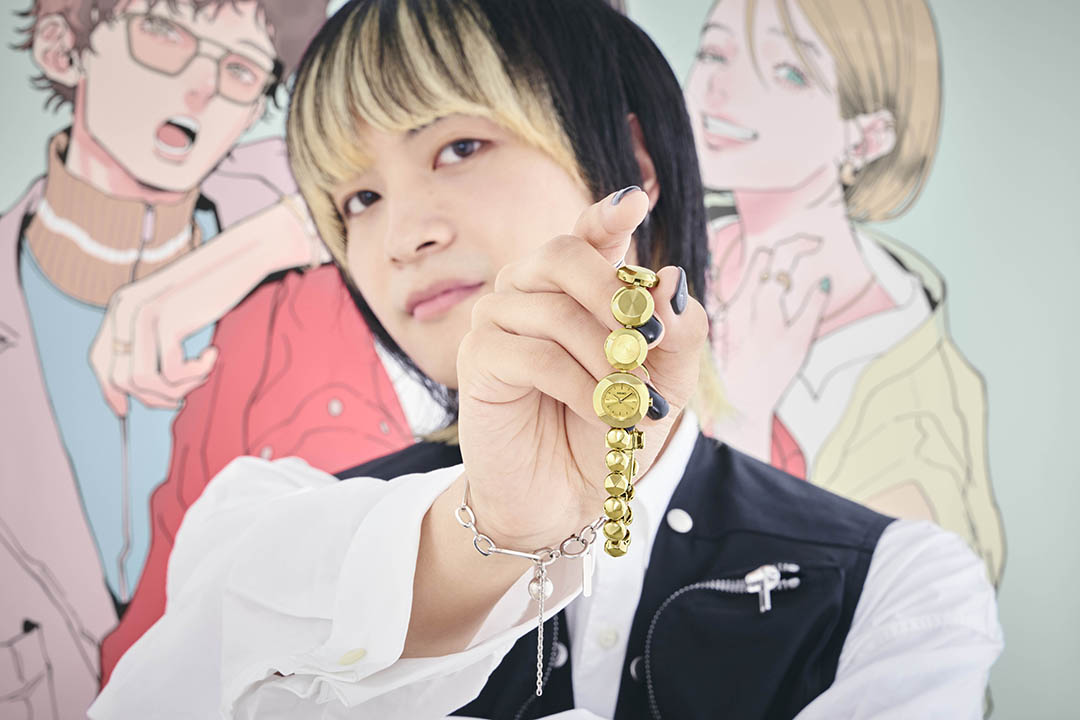
菅沼佑哉(Yuya Suganuma): 这只焕新款最显著的特点,是表壳上下两侧的表链链节尺寸与形状各不相同。这一设计就是想打破人们 “小巧的腕表就是女表” 的固有印象。通过将表壳与上侧表链的设计融为一体,并使表壳处链节造型形成鲜明对比,我们力求打造出一款“跳出传统印象,格调独具”(积极意义上)的作品。同时,当下大尺寸表链正成为流行趋势,这一时尚印象也为我们的设计提供了灵感。
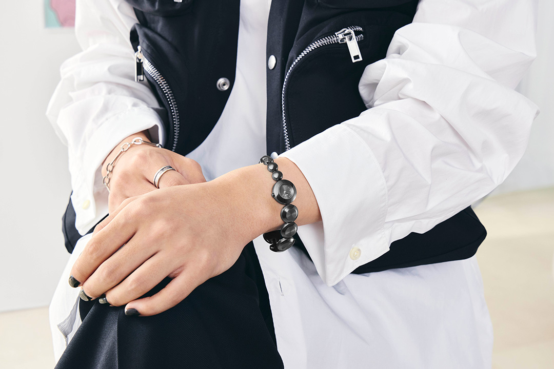
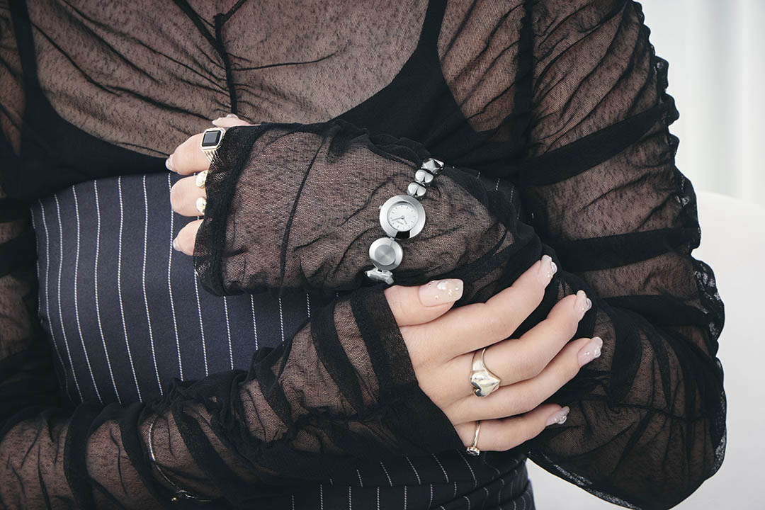
NAKAKI PANTZ: 原来如此,很有道理!我喜欢佩戴契合个人品味的饰品,偏爱那些凭直觉就觉得有吸引力的设计,而非为特定需求而特意打造的产品。“collection 1 ”正是我偏爱的类型,日常佩戴足够休闲随性,而且只有金、银、黑三种配色,十分简约大气。
另外,得知这款腕表出自与我同龄的年轻设计师之手,我感到很惊喜。你通常是从何处汲取设计灵感的?
菅沼佑哉(Yuya Suganuma): 当我遇到喜欢的事物时,会努力寻找其中吸引我的核心元素。这不仅包括三维实体物件,还涵盖传统工艺、绘画等多种形式。我会在各种领域中收集灵感碎片,逐一记下“我喜欢这个颜色”或“这种造型组合很有趣”之类的想法,慢慢积累各种设计思路。
NAKAKI PANTZ: 和我一样,你的灵感来源也十分多元。我通常会浏览 Pinterest、Instagram等社交媒体,寻找配色等方面的参考。你更倾向于从真实可见、可触、可感的事物中直接汲取灵感,我则多从二维素材中获取思路。或许创作的本质是相通的,但这种差异也反映了我们所产出内容的不同属性。这真的很有意思!
打破刻板印象,触动个人审美共鸣
菅沼佑哉(Yuya Suganuma)同时负责Seiko power design project设计专案及该系列下“collection 1”视觉图的设计总监,正是他邀请NAKAJI PANTZ参与插画创作。
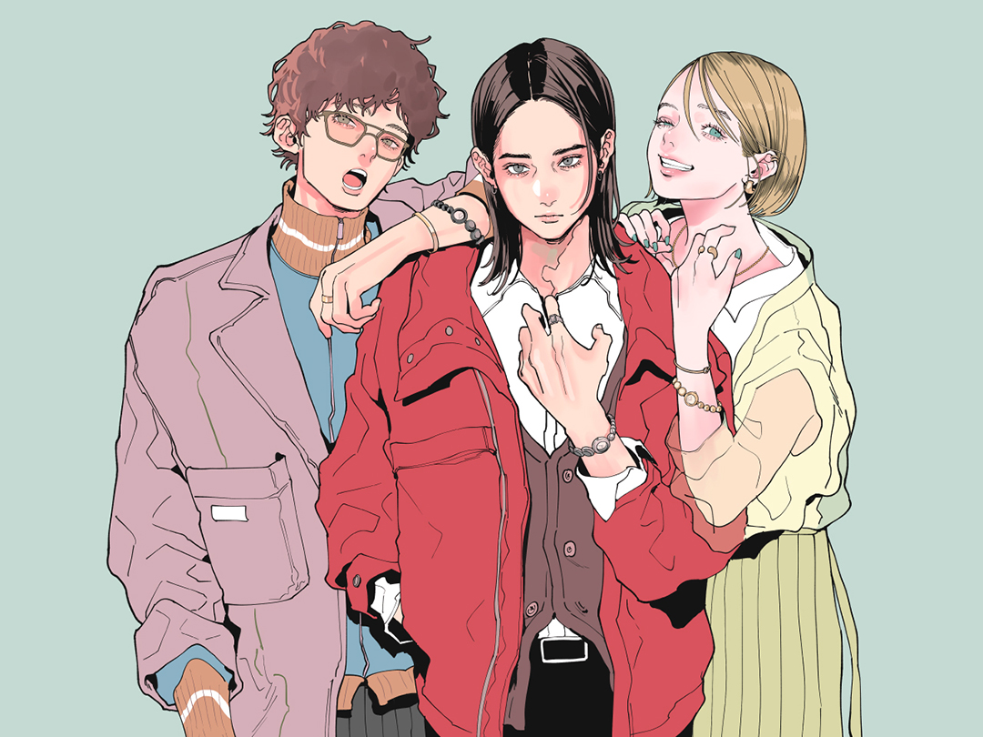
菅沼佑哉(Yuya Suganuma): 在构思视觉呈现时,我想到了NAKAJI PANTZ 擅长绘制的人物风格,她的审美与我产生了强烈共鸣。我觉得她那种兼具怀旧感与新鲜感的创作调性,与本项目高度契合,因此主动找到了她。
NAKAKI PANTZ: 非常感谢你的认可。一开始我还担心自己能否胜任一家传统大企业的合作项目,但也真切希望不辜负这份信任。由于“collection 1”腕表的受众涵盖各个年龄段,我在创作时始终怀着使命感,不断思考自己被选中参与本项目的原因。
我坚信选择这款腕表的人,一定会受到周遭人的赞赏。在设计这三个人物时,我脑海中浮现的是那些让人产生“我想成为像他们那样的人”或“我想戴他们同款腕表”的形象。在我个人的创作中,经常会绘制佩戴各类配饰的人物。这次为“collection 1”打造的视觉作品感觉恰到好处——腕表在人物身上既自然协调,又独具辨识度。我对最终的视觉呈现很满意。
菅沼佑哉(Yuya Suganuma): 视觉创作的每一个阶段都让我印象深刻。看到自己想象中佩戴这款腕表的人物被完美呈现出来,我感到格外有趣。归根结底,腕表设计的核心是扪心自问:“我想佩戴什么样的腕表?”我也提供了大量时尚写真和肖像照片作为参考素材,并始终围绕着两个问题:“我们想成为什么样的人”以及“我们希望看到怎样的人佩戴这款腕表”。
NAKAKI PANTZ: 你向我传递了非常细致的视觉构想,所以我们才能配合得如此默契。我创作人物时,会先确定他们的性格或基本特质。对于主要人物角色,我希望塑造一个强大、自信且无明确性别指向的形象。
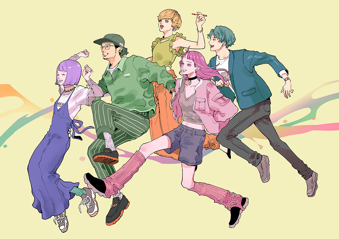
菅沼佑哉(Yuya Suganuma): 我们希望这款腕表能吸引那些不受固有观念束缚、凭个人审美做选择的人。即便在主视觉图中,我们也刻意避开了僵化的刻板印象。另一组视觉作品围绕Seiko power design project主题展开,呈现效果也十分出色。
我希望通过视觉效果传达设计师们携手推进项目的态度,我期待表达出团队的活力、前进的动能,以及成员们乐在其中的氛围。
NAKAKI PANTZ: 我设计了五个色彩鲜明的人物,分别以紫、绿、黄、蓝、粉为主色调,同时刻意避免让他们看起来像一支规整的队伍。这五个人物在年龄和性别上各有差异,但都朝着同一个方向前行。我想,他们整体呈现出阳光积极的形象。
菅沼佑哉(Yuya Suganuma): SEIKO的设计团队由风格多元、各具特色的成员组成。因此,我很欣喜你能够在视觉呈现中精准传达出这份多样性。
创作者的审美共鸣,触动人心
SEIKO拥有悠久历史,往往被视为重视传统的企业。基于这一背景,Seiko power design project在未来将扮演怎样的角色?
菅沼佑哉(Yuya Suganuma): 对于常规量产表款,我们在一定程度上需要聚焦于能被广泛接受的设计——这是设计师的职责之一。但我认为,我们的另一项职责是展现突破常规的思维能力,推出有趣的创意与解决方案。
我相信,汇聚众多富有创造力的设计师,将他们的审美理念忠实地转化为产品,并以人们可佩戴的形式推向市场,这是一项极具意义的事业。
NAKAKI PANTZ: 参与这个项目时,我也有同样的感受。SEIKO给人的印象较为保守,因此看到公司以如此富有趣味性的方式打造腕表,我感到十分惊喜。这种跳出固有框架的设计思路能催生出如此精美的作品,让我深感欣慰。
如果我是产品设计师,看到“collection 1”的设计,肯定会觉得有些“意难平”。有些人可能会觉得“我差点也想到了这个点子”,但将“差点”转化为“突破”,难度极大。这最后一步往往取决于时机、机遇与灵感的共同作用。归根结底,创作不就是这样不断重复尝试的过程吗?
菅沼佑哉(Yuya Suganuma): 我认为,“我或许也能想到这个点子”的感受,是设计中非常重要的一环。换句话说,这是一种共情。日常生活中的微小感悟与发现,可能会转化为对某人而言全新的价值,或与他人产生共鸣。而这种连接感,很可能正是催生真正优秀作品的关键瞬间。
人物简介
NAKAKI PANTZ 插画师。其创作的女性形象兼具力量感、美感与真我特质,广受好评。她曾为众多时尚品牌提供创意作品,同时也涉足广告视觉、音乐视频插画等专业领域。本项目中,她受邀为Seiko power design project设计专案及该系列下“collection 1”的视觉作品。
菅沼佑哉(Yuya Suganuma)于2021年加入精工表株式会社,现任设计师一职。目前负责品牌产品设计工作,主攻Seiko 5 Sports 系列。在2022年power design project中“REBIRTH”(重生)主题设计项目中担任主设计师,发布的“TISSE our time”腕表的后续表款已作为“collection 1”系列产品正式推向市场。
撰文:Tetsuo Shinoda